
 Tweet
Tweet
Re: The Official Graphics Tournament
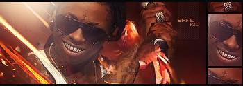
blownoffkush
wayneYMCMB
Me me
killed it

blownoffkush
wayneYMCMB
Me me
killed it

 ill work on something dope for the next round


Comment