Become a member of the Lil Wayne HQ Forum. Register Today!
Congratulations on finding the biggest and best forum for everything Lil Wayne and Young Money Entertainment.
If this is your first visit, be sure to check out the FAQ, and to join in discussions with other members of this board you will need to register with us. As a registered member, you will gain access to every forum, able to post, create new threads, send and receive private messages, search and plenty more cool features! Register today!
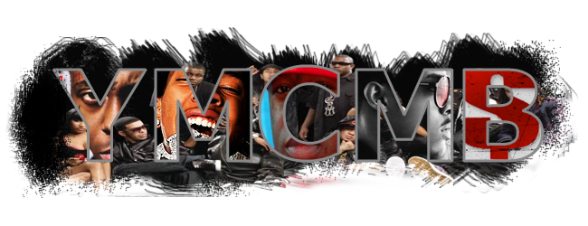
its not simple, thres a loooooot going on.. hehe
but its cool. only thing is the background (We are YM album cover) looks compressed.. badly like you gotta keep the proportions or it looks ugly.... also birdman looks like that ....
other than that it looks nice, like the concept just a more congruency between all the pics would be better... and work the brushed background as well
the compressing thing is true other than that it is sick as hell!

 Tweet
Tweet


Comment