Announcement

Collapse
No announcement yet.

Graphics Tournament II Final Round

Collapse
X
 
  • Filter
  • Time
  • Show
Clear All
new posts

  • Graphics Tournament II Final Round

    Voting:

    You must have 50 posts to vote, when voting please post 3 reasons you have voted for who you voted if not the vote will not count. Please view both the final piece and stock image before voting. Until the end of the round the participants will be kept anonymous, once the voting period has ended the votes will be counted and the winner will be named.

    Good luck to all participants.


    Seed 1
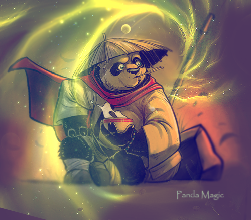


    Stock


    Seed 2



    Stock


    Seed 12



    Stock
    21
    Seed 1
    0%
    12
    Seed 2
    0%
    6
    Seed 12
    0%
    3

  • #2
    Re: Graphics Tournament II Final Round

    I Voted For Seed 1:

    1. All The Effects/C4D's Seem To Blend Better Than On The Other Two Pieces.
    2. It Looks Much Cleaner Than The Others.
    3. There Is A lot Of Depth, Which Is What I Like.

    Comment


    • #3
      Re: Graphics Tournament II Final Round

      seed 11 hbchc

      Comment


      • #4
        Re: Graphics Tournament II Final Round

        lol wtf,why are the sigs about anime...


        anyway

        voted for seed 1,becaue it looks very original,everything is very clean,but still not boring,like tha light effects and the colours

        Comment


        • #5
          Re: Graphics Tournament II Final Round

          Why is it anime??

          Voted 2 cuz did a very good job eliminating tha second character. I also like tha black & white. Tha graphics aren't too dramatic but go well with tha character.


          Comment


          • #6
            Re: Graphics Tournament II Final Round

            Seed one. effects look better, its cleaner than the other two. i also like pandas.

            Comment


            • #7
              Re: Graphics Tournament II Final Round

              Seed 1

              Looks fucking sick! That green effect looks like a dragon or something.
              Cute stock (no homo).
              Overall better.

              Comment


              • #8
                Re: Graphics Tournament II Final Round

                Seed 2
                - Like the simplicity
                - Like the colors
                - The other seeds are SOFT as fuck lolz.


                protect dunston at all costs

                Comment


                • #9
                  Re: Graphics Tournament II Final Round

                  Seed Two,
                  most work done
                  really simple
                  streetfighter >>>
                  xxxxxxxxxxxxxxxxx

                  Comment


                  • #10
                    Re: Graphics Tournament II Final Round

                    Seed one, the c4d effects are on point

                    ^^ Created by Jake_YMCMB

                    Comment


                    • #11
                      Re: Graphics Tournament II Final Round

                      Im having a really difficult time with this one. As an experienced graphic designer(yes I am! dont doubt me! lol), I see a few problems with each....

                      For #1...I initially was going to vote for this entry, but I cant tell how much work was put into this. I could be wrong and it could've been a sig that took an hour to make, but at first glance it looks like a 3-5 layer sig. Plus, the bottom left corner doesnt look good because it's such a sharp cut off when you look at the rest of the sig, which is very easy flowing.

                      For #2....I did vote for this one. I think it needs alot more detail and text and some better lighting if it is all done correctly. Because I am choosing this one as the winner, I wont go into more detail on what else should be added.

                      For #12....The colors dont flow or match very well and the text is so out of place that it bothers me. With that said, it isnt a bad sig. I can tell there is detail in this one and effort was put forward. I just don't think it was executed well.

                      With all that said, once again, I voted for #2.

                      Comment


                      • #12
                        Re: Graphics Tournament II Final Round

                        seed 1
                        -looks best
                        -love that movie
                        -effects are sick

                        Comment

                        Working...
                        X