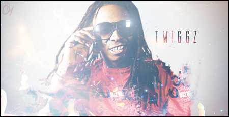
Here ya goo twiggy.

feedback ?
edited*

feedback ?
edited*
 I like that you kept the theme the same colour as Weezys shirt, it fits the whole Sig pretty good. I also like the thingy you did with his left arm, but imo its too much on the right arm... Although its good you kept his hand, I would've liked to see a lil bit more of his arm. Nothing to criticise at the font, like the colour, like the style. Biggest negative point is imo the lightning right in the middle, its too bright and too blurry. Some might like it, personally its not my thing.
 - but Twiggz can feel lucky.


 I like that you kept the theme the same colour as Weezys shirt, it fits the whole Sig pretty good. I also like the thingy you did with his left arm, but imo its too much on the right arm... Although its good you kept his hand, I would've liked to see a lil bit more of his arm. Nothing to criticise at the font, like the colour, like the style. Biggest negative point is imo the lightning right in the middle, its too bright and too blurry. Some might like it, personally its not my thing.
 - but Twiggz can feel lucky.


Comment