Become a member of the Lil Wayne HQ Forum. Register Today!
Congratulations on finding the biggest and best forum for everything Lil Wayne and Young Money Entertainment.
If this is your first visit, be sure to check out the FAQ, and to join in discussions with other members of this board you will need to register with us. As a registered member, you will gain access to every forum, able to post, create new threads, send and receive private messages, search and plenty more cool features! Register today!
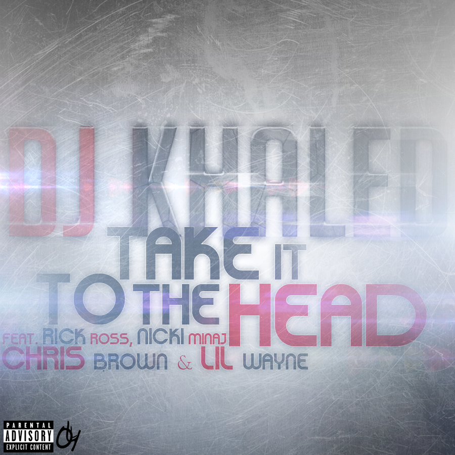
Your stuff recently is all just too bright for me man, your lighting techniques are cool, but you add way too much light. I think if you toned it down a bit they would look much better.
Apart from the lighting everything else looks pretty decent!
Gonna use the Take It To Head one, its pretty nice. Although - like Kuzz said - its a lil bit too bright, I like the simpleness and the fonts Can't really say more about that, its simple but good tho
Your stuff recently is all just too bright for me man, your lighting techniques are cool, but you add way too much light. I think if you toned it down a bit they would look much better.
Apart from the lighting everything else looks pretty decent!
Thanks homie, yeah I know its a bit too bright, but thats my trending style for now if ya get me. so it will change after a few covers again
Gonna use the Take It To Head one, its pretty nice. Although - like Kuzz said - its a lil bit too bright, I like the simpleness and the fonts Can't really say more about that, its simple but good tho

 Tweet
Tweet


Comment