-
-
Seems odd for some reason, but its cool wit me
Edit: btw why is everyone making the d4 covers like d3, is it because d1 and d2 looked alike or is it because ya'll don't think the official will look different?
-
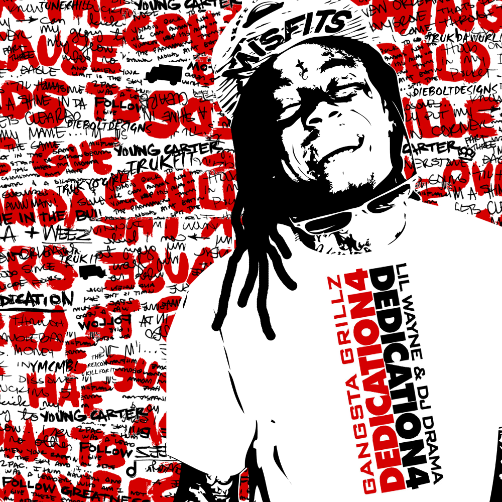
Really cool, but his face isn't really clear...like between the teeth and the lips, maybe you want to add more details to that..
Other than that, it's really cool!Originally posted by Shake

Comment
-
As it isn't the same type of "texture" used (this looks less "drawed") I don't really feel it tbh.
Comment
-
Like it more then Olly's covers but thats opinion. Great Job!Comment
-
its cool, but yeah, too much detail in his face. did you not use the pen tool?Comment
-
-
-
Just noticed now. Roflmao @ the on-painted dreads. that looks soo dumb! No offense bruh.
Comment
-
This would be a much doper stock tbh
EDIT:

but dope af. but the stock isnt the right one tbh.Last edited by weezy f baby; 07-23-2012, 07:11 PM.repetition is the father of learning
Comment
-
agreed, i dont think it looks dumb. however, i think it could be improved if you tried the pen tool.Originally posted by dieboltdesigns View PostComment
Become a member of the Lil Wayne HQ Forum. Register Today!
Congratulations on finding the biggest and best forum for everything Lil Wayne and Young Money Entertainment.
If this is your first visit, be sure to check out the FAQ, and to join in discussions with other members of this board you will need to register with us. As a registered member, you will gain access to every forum, able to post, create new threads, send and receive private messages, search and plenty more cool features! Register today!

 Tweet
Tweet


Comment