Announcement

Collapse
No announcement yet.

Curtains

Collapse
X
 
  • Filter
  • Time
  • Show
Clear All
new posts

  • Curtains

    It is not finished yet, but I was having trouble with the text so I came up with this lay-out. Could you guys give some feedback on the text and it's 'effect'? Note: the image and font are low quality.
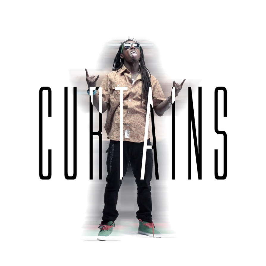
    edit: this isn't a cover i'm making for this song just testing the text.
    Attached Files

  • #2
    I think you should take out the white part of the text..looks weird...nice fuckin photo tho

    Comment


    • #3
      text looks great

      Comment


      • #4
        Originally posted by Leaff View Post
        I think you should take out the white part of the text..looks weird...nice fuckin photo tho
        Originally posted by Lil wayne prezident View Post
        text looks great
        Thanks for the feed back!
        Still not sure if the white part make it more or less readable.

        Comment


        • #5
          How are you doing that text? I like it tho


          The 6ix god is watching i hope you prepared to face em

          Comment


          • #6
            Originally posted by LikeThatSwag View Post
            Thanks for the feed back!
            Still not sure if the white part make it more or less readable.
            maybe add a black stroke around it so then it would only be visible over the white parts and make it more readable?

            Comment


            • #7
              Originally posted by walkerwiseman View Post
              How are you doing that text? I like it tho
              Just made to text layers one in white and one in black. Selected Wayne and deleted the black parts on wayne and the white parts that are not one wayne.

              Originally posted by Lil wayne prezident View Post
              maybe add a black stroke around it so then it would only be visible over the white parts and make it more readable?
              Thanks, Im going to try that later!

              Comment


              • #8
                Originally posted by LikeThatSwag View Post
                Just made to text layers one in white and one in black. Selected Wayne and deleted the black parts on wayne and the white parts that are not one wayne.


                Thanks, Im going to try that later!
                Thanks. I loveing this. The original photo looks sick


                The 6ix god is watching i hope you prepared to face em

                Comment


                • #9
                  nice work

                  nothing needs changing 4bh

                  Comment


                  • #10
                    I think it's pretty dope man. Simple but effective.

                    Comment


                    • #11
                      Originally posted by WeEeEeEzZzZyYy View Post
                      nice work nothing needs changing 4bh
                      Originally posted by ABjerg View Post
                      I think it's pretty dope man. Simple but effective.
                      Thanks for the feedback!

                      Comment


                      • #12
                        Not really into this text effect. Perhaps if you'd use a 'fatter/bigger' font. Font itself is nice, but I think not for this concept.

                        Comment

                        Working...
                        X