Announcement

Collapse
No announcement yet.

Wayne Forum Signature

Collapse
X
 
  • Filter
  • Time
  • Show
Clear All
new posts

  • Wayne Forum Signature

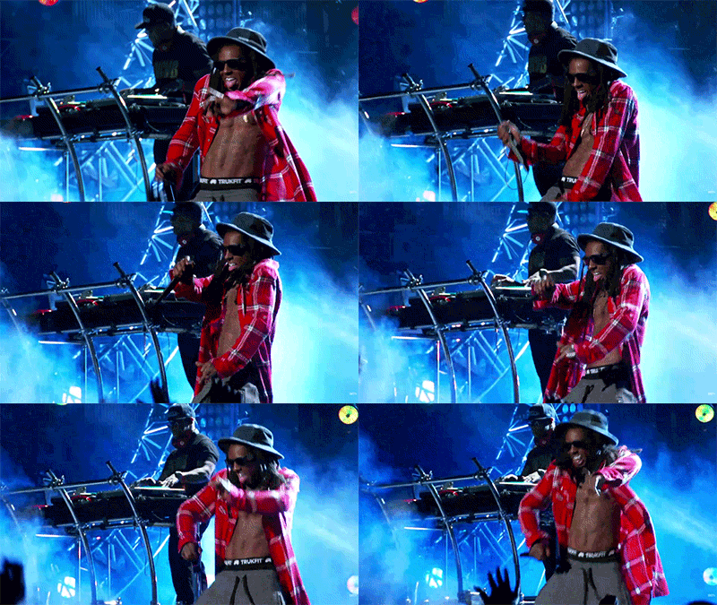
    Check out my Signature.
    Im just starting to learn photoshop and watched a few tutorials on youtube,
    so I made me this sig.

    Tell me what you think or what i could do better.

  • #2
    looks good to me homey.

    Comment


    • #3
      For a signature I like it

      Comment


      • #4
        A few tips:

        It looks like you faded Wayne a bit. Try to duplicate that layer and edit it for example so he doesn't look so transparent.
        If you blur and/or darken the C4D effects and sharpen Wayne a bit, there will be a lot more focus on him and less on the sides (which I personally like in a signature).
        And work on the text, but I know that sucks on a sig.

        Keep it up mate, you're good!

        Comment


        • #5
          Originally posted by Woocky View Post
          A few tips:

          It looks like you faded Wayne a bit. Try to duplicate that layer and edit it for example so he doesn't look so transparent.
          If you blur and/or darken the C4D effects and sharpen Wayne a bit, there will be a lot more focus on him and less on the sides (which I personally like in a signature).
          And work on the text, but I know that sucks on a sig.

          Keep it up mate, you're good!
          Thanks for your tips man.

          What do you mean with text editing sucks on sigs? What is good to do with texts?
          I didnt watch any text tutorials so far so I dont really know what to do with them. Any tips what is a must for texts?

          Comment


          • #6
            Originally posted by M.O.B. View Post
            Thanks for your tips man.

            What do you mean with text editing sucks on sigs? What is good to do with texts?
            I didnt watch any text tutorials so far so I dont really know what to do with them. Any tips what is a must for texts?
            Well I mean that I don't really know how the best text looks like in signatures looks.
            Some people make it big and shiny, while others keep it small and transparent. I think it both looks good but depends on the sig and theme. I like the purple glow in yours cuz it fits the purple C4D, but I dont like the font and size or opacity.

            Keep playing with it and try new styles all the time.

            Comment


            • #7
              I like it, it's dope, but you should have used a different text on the picture.

              Comment


              • #8
                Originally posted by Woocky View Post
                Well I mean that I don't really know how the best text looks like in signatures looks.
                Some people make it big and shiny, while others keep it small and transparent. I think it both looks good but depends on the sig and theme. I like the purple glow in yours cuz it fits the purple C4D, but I dont like the font and size or opacity.

                Keep playing with it and try new styles all the time.
                Ok thanks. This was exactly my intention, but maybe I should lower the opacity or something like that.

                - - - Updated - - -

                Originally posted by YoungTunechie View Post
                I like it, it's dope, but you should have used a different text on the picture.
                Ok thanks for your advice. You mean like a wayne lyrics quote?

                Comment


                • #9
                  Looks good for a first time. Nice.
                  ​repetition is the father of learning

                  Comment


                  • #10
                    Y'all remember when the GFX was not dead and every other day someone would post something and errbody would comment on it
                    Originally posted by Shake
                    Why so negative all the time???

                    Comment


                    • #11
                      Originally posted by M.O.B. View Post
                      Ok thanks. This was exactly my intention, but maybe I should lower the opacity or something like that.

                      - - - Updated - - -


                      Ok thanks for your advice. You mean like a wayne lyrics quote?


                      Sorry for replying so late, but i just saw that you had quoted me, i somehow missed it, but anyways, i meant you should have used a different font on the picture.

                      Comment


                      • #12
                        Originally posted by YoungTunechie View Post
                        Sorry for replying so late, but i just saw that you had quoted me, i somehow missed it, but anyways, i meant you should have used a different font on the picture.
                        Okay now i get what you meant. thanks.

                        Comment

                        Working...
                        X