Become a member of the Lil Wayne HQ Forum. Register Today!
Congratulations on finding the biggest and best forum for everything Lil Wayne and Young Money Entertainment.
If this is your first visit, be sure to check out the FAQ, and to join in discussions with other members of this board you will need to register with us. As a registered member, you will gain access to every forum, able to post, create new threads, send and receive private messages, search and plenty more cool features! Register today!
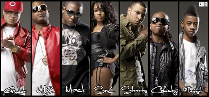
Ok, iv made sum changes to the colour of the text, which colour looks best? So that i can make them all the same? And can people recomend fonts or anything else that needs done?
CMM is almost stealing my style LOL nah I'm just messing.
Looks dope as hell bro
Originally posted by WhiteMamba
Ok, iv made sum changes to the colour of the text, which colour looks best? So that i can make them all the same? And can people recomend fonts or anything else that needs done?
V1
V2
Once again be hasrh lol.
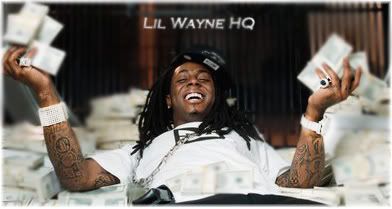
Not bad for first efforts bro. I don't like the writing though, just one thing saying "Lil Wayne" would be better, and add a border
something i did really fast, i know is not beast like the experts be doen, im a noob
Pretty Boasty For A Rush Job
Looks like a blur and text. If you didnt blur the stacks in his had that would have depth.
Originally posted by "Lil' Chamillitary":29by09ul
Originally posted by wayneYMCMB
Thanks, you have any tips or tuts to make better sigs? Like something like your Kobe one?
no not really i just eff around with smudging,brushes and filters.Biggest tip I can give you is use ur creativity.
To some extent that is true but you do need loads of tutorials to boost your knowledge.
I still use many today.
Some new stuff
[/quote:29by09ul]
I still use tuts today too, Learn new things. ^ Not feeling the last sig. Don't like the half blur of the C4D's.[/quote:29by09ul]
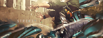
Well thats high-end depth LOL. It brings more focus to one layer. The middle bit. Back and front blur and middle sharp.
Originally posted by WhiteMamba
Ok, iv made sum changes to the colour of the text, which colour looks best? So that i can make them all the same? And can people recomend fonts or anything else that needs done?
V1
V2
Once again be hasrh lol.
Well you just started so i wont be harsh. Its good but try to keep things simple. Jus mess around with ocean ripple effects and displacement maps. You be good soon bro
Im either running from life or im just waiting to die im the supplier or fire if you chasing a high.
Its the king of the south niggur T.I
Comment