Announcement

Collapse
No announcement yet.

[Official] Signature Showcase Thread

Collapse
X
 
  • Filter
  • Time
  • Show
Clear All
new posts

  • Re: [Official] Signature Showcase Thread

    first sig i did in like a month

    Comment


    • Re: [Official] Signature Showcase Thread

      Originally posted by CashMoneyMillionaire
      first sig i did in like a month

      that sig is fire!

      but hey bruh, wtf happent to that sig you would make me? :suprised:

      [quote=Mr. AnDz][quote=CashMoneyMillionaire]
      Originally posted by "Mr. AnDz":2ko2hufx
      Originally posted by YoungTwistOfLife
      Originally posted by "Mr. AnDz":2ko2hufx
      Originally posted by YoungTwistOfLife
      Thanks Dude Fckinn Great Sig
      you are not even usin' it :suprised:
      I Had Another One
      why the fuck did you so say '' I Want A Sig'' ?
      i really want that sig, caus' its fucking fire! and i would at least use it.

      yo i would give it to you but i didnt save the psd so i cant take out the text that says Young twist...

      but give me some time and ill hook you up with a dope ass sig..[/quote:2ko2hufx]
      wow thanks mate, sounds dope! [/quote:2ko2hufx]
      LOL!

      Comment


      • Re: [Official] Signature Showcase Thread

        Originally posted by CashMoneyMillionaire
        first sig i did in like a month

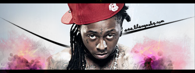
        It's nice, Smudging is cool. Lighting could be better and that Pen-tooling should be a clipping mask of the smudge to fit the colour scheme. Black doesn't look right.

        Comment


        • Re: [Official] Signature Showcase Thread

          Originally posted by CashMoneyMillionaire
          first sig i did in like a month

          one of the first sig i really like from you bro good work its dope

          Comment


          • Re: [Official] Signature Showcase Thread

            Comment


            • Re: [Official] Signature Showcase Thread

              Originally posted by CashMoneyMillionaire
              first sig i did in like a month

              Oooh I like that
              Good job.

              Comment


              • Re: [Official] Signature Showcase Thread

                Originally posted by Killabeatz
                I like it homie!

                Comment


                • Re: [Official] Signature Showcase Thread

                  Originally posted by Killabeatz
                  it looks good, not liking the smudging tho

                  Comment


                  • Re: [Official] Signature Showcase Thread

                    Artille Started The Free Weezy Bar. This Is My Updated Version.


                    It Matches The Site Layout, Text Is Cleaner & Picture Is Not Black & White.


                    Comment


                    • Re: [Official] Signature Showcase Thread

                      Originally posted by CashMoneyMillionaire
                      first sig i did in like a month

                      looks good but you need to work on the colours
                      try to make em matchin better together
                      use adjustment layers and gradients
                      the effects look kinda misplaced
                      you didnt work em in correct
                      keep practicin

                      Originally posted by Killabeatz
                      you tried to give it some depth but you its way too much
                      you need to find a good combination of sharp n soft.. atm its a huge difference
                      the lighting is wrong
                      colours match but are too simple
                      you should use 1 colour more
                      effects are okay except the lightdot thingys on tha left
                      anyway the text is pretty good.. next time move it a bit closer to the render
                      keep it up


                      Comment


                      • Re: [Official] Signature Showcase Thread

                        Originally posted by vorthaxX
                        Originally posted by Killabeatz
                        you tried to give it some depth but you its way too much
                        you need to find a good combination of sharp n soft.. atm its a huge difference
                        the lighting is wrong
                        colours match but are too simple
                        you should use 1 colour more
                        effects are okay except the lightdot thingys on tha left
                        anyway the text is pretty good.. next time move it a bit closer to the render
                        keep it up
                        Most of what he said. Your light should be coming from the top right corner.
                        Your flow is gettin messed up 'cos of that wave filter, try loosing it.
                        Its really monotone so yeah, try to add in another colour
                        You've randomly sharpened parts of his body and not others. Try to gradually increase it as you get to your focal point.
                        Im either running from life or im just waiting to die im the supplier or fire if you chasing a high.
                        Its the king of the south niggur T.I


                        viewtopic.php?f=18&t=9602&p=98091#p98091
                        ^Click dis fo' ma work

                        Comment


                        • Re: [Official] Signature Showcase Thread

                          Originally posted by Hero_Kid
                          Originally posted by vorthaxX
                          Originally posted by Killabeatz
                          you tried to give it some depth but you its way too much
                          you need to find a good combination of sharp n soft.. atm its a huge difference
                          the lighting is wrong
                          colours match but are too simple
                          you should use 1 colour more
                          effects are okay except the lightdot thingys on tha left
                          anyway the text is pretty good.. next time move it a bit closer to the render
                          keep it up
                          Most of what he said. Your light should be coming from the top right corner.
                          Your flow is gettin messed up 'cos of that wave filter, try loosing it.
                          Its really monotone so yeah, try to add in another colour
                          You've randomly sharpened parts of his body and not others. Try to gradually increase it as you get to your focal point.
                          Yeah thanks for the critiques...i was following a tutorial, and i wasnt diggin my smudge either i just closed it and saved it as a jpeg. So couldn't fix it.

                          Comment

                          Working...
                          X